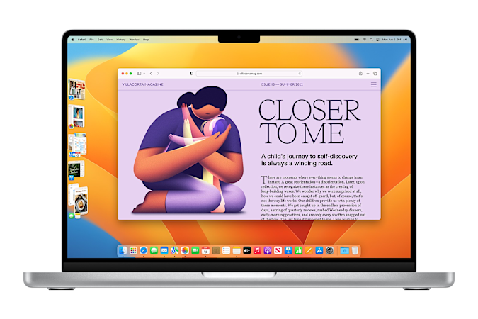
It’s rare for Apple to reshape the way people work on Macs, but that’s precisely what the company is trying to do with Stage Manager in macOS Ventura. At first glance, it’s just a quick visual way to swap between your recently used applications. But after testing the first Ventura public beta over the past week, I think it may also solve window management issues that have plagued Macs since OS X debuted 21 years ago. Or, maybe, I’ve just always hated Apple’s Dock.
On top of Stage Manager, Ventura also has plenty of upgrades that should make life a bit easier for Apple users. Mail gets the biggest overhaul, but there’s also better collaboration with Safari’s Tab Groups, as well as much-needed features in Messages. At the very least, it’s a far more expansive update than .

Apple
Stage Manager: Making sense of the Mac madness
In my nearly two decades of using Macs — as a college student, IT support worker and tech journalist — I’ve never found OS X’s Dock to be very useful. Sure, when it was first released, it was a huge visual upgrade over the simplistic taskbars in Windows and Linux. (I remember marveling at the fact that a Dock icon could show a running video.) But on its own, the Dock is a confusing mishmash of shortcuts and running application indicators, something also criticized.
If you want to find a specific Safari window, for example, you have to press Control, click on the Dock icon and then select it from the dropdown. In comparison, the far uglier Windows XP let me zero in on specific apps (and their sub-windows) with a single click on the task bar. Perhaps aware of this usability quirk, Apple introduced Exposé in 2003 as an easy way to see everything you’re running all at once. Since then, I’ve religiously assigned hot corners on every Mac I’ve used to trigger specific Exposé functions (one corner shows everything that’s open, another shows me windows just for my current app, while another brings me right to the desktop). Who needs a confusing Dock when you can get a God’s-eye view of your entire system?
Fast-forward almost twenty years, and we have Stage Manager, yet another on-screen tool for jumping between your apps. But while it may just seem like additional screen clutter, its main function is to help you focus by actually decluttering your screen. When you select a recent app from Stage Manager, it centers that app on your screen and makes other windows disappear. Hit the app shortcut again, and you’ll cycle through open windows.
Credit: Source link


Comments are closed.