Being a smartphone startup is hard, particularly when you’re up against tech giants like Apple, Google and Samsung. But after selling more than 500,000 Phone 1s last year, Nothing has returned with a sequel: the Phone 2. And while it looks similar to the previous model, it feels like Nothing is finally figuring out its groove. Not only does it have a significantly faster CPU, its cameras have been improved, and we’re finally seeing Nothing’s vision of a more thoughtful and deliberate UI. Even the phone’s most distinctive feature – its Glyph interface – offers enhanced customization and added functionality. But perhaps most importantly, the Phone 2 will officially be available in the US. And while this added sophistication comes at an increased cost, it’s still very affordable at $600. In a sea of Android phones that often blend together, getting an eye-catching device for a reasonable price is definitely something notable.
Design
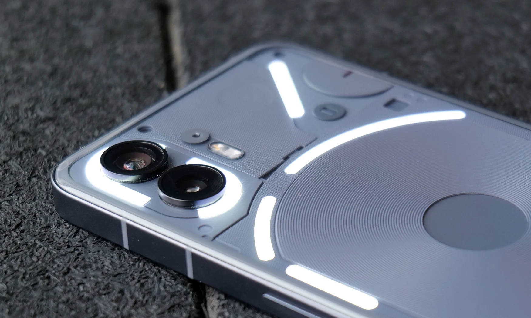
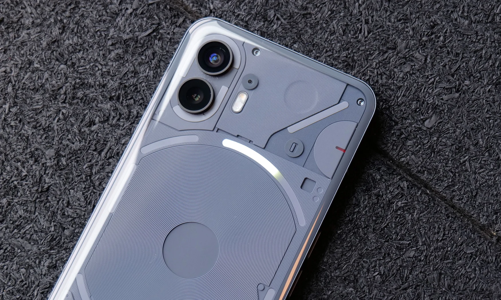
Compared to most phones that are clad in a blank sheet of glass, the Phone 2 (which is available in white or a new gray color) is a stunner. Its transparent Gorilla Glass back reveals a monotone assortment of components, allowing you to see things like its magnetic charging coil, power cables and more. It’s not messy, though. Everything is buttoned up just enough, and there are human touches like arranging some of the components to look like an elephant. I’ve been told there are other creatures hiding as well, but I haven’t spotted them yet. It’s like having a cyberpunk art installation in your pocket.
Of course, there’s also the Glyph interface which consists of a number of LED strips that pulse, strobe and glow. For this model, Nothing more than doubled the number of lights from five to 11, while also adding support for addressable zones, which allows for gradient effects. Unfortunately, there’s still only one color to choose from: white.
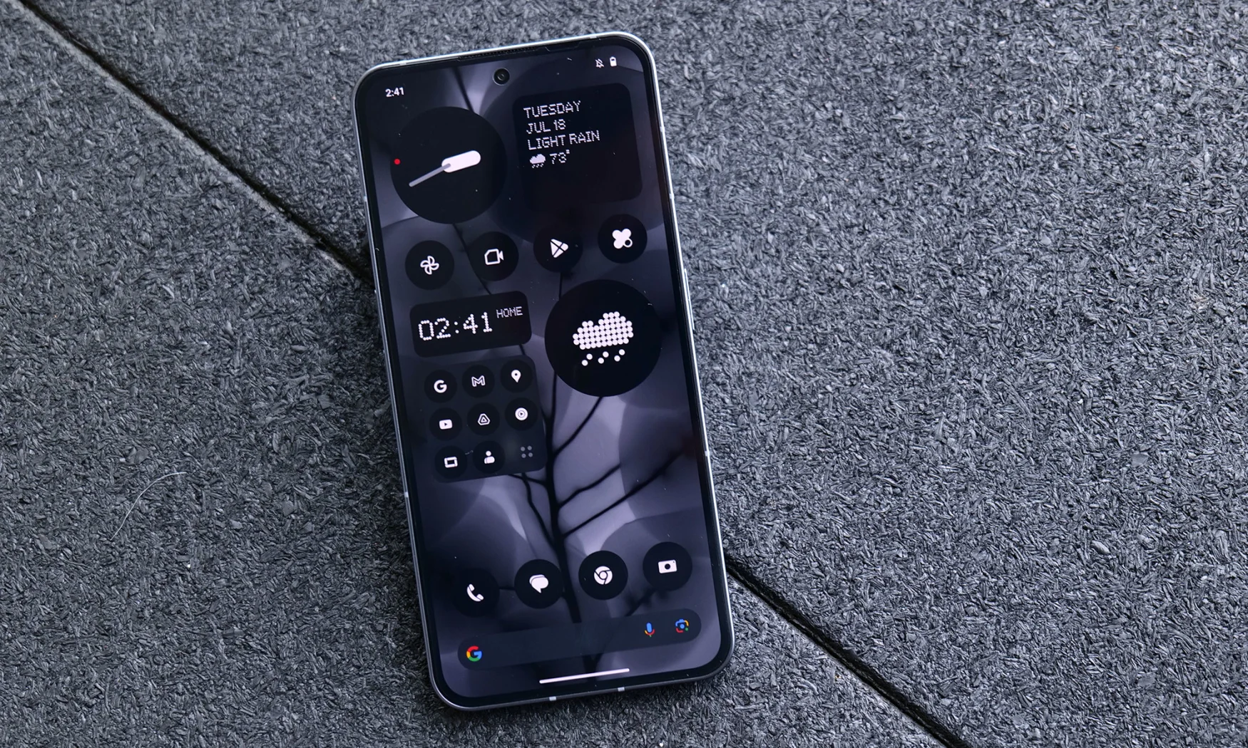
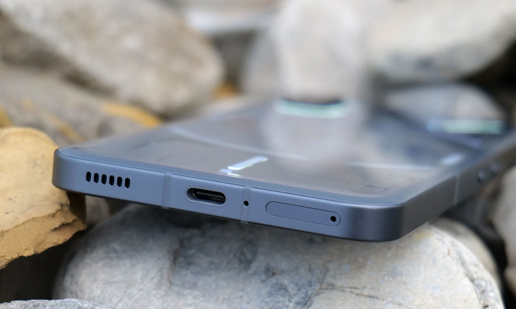
As for the rest of the device, it’s very similar to the Phone 1 including a metal frame with flat boxy sides and an iPhone-like button layout for power and volume. The one big change is that Nothing used 2.5D glass with rounded edges in back which sports curves that sit more naturally in your hand without digging in.

Photo by Sam Rutherford/Engadget
Meanwhile, its 6.7-inch OLED display delivers excellent brightness (with peaks of well over 1,000 nits in my testing), rich colors and a speedy 120Hz refresh rate. You also get an in-screen fingerprint reader for simple and secure biometrics which is both fast and accurate.
Performance
The Phone 2 packs a Qualcomm Snapdragon 8+ Gen 1 processor, 8GB or 12GB of RAM and up to 512GB of storage. Sure, its chip is a year old, but it handled games and editing photos without a hint of lag. When combined with speedy UI animations and a lightweight Android skin, the Phone 2 feels incredibly responsive and snappier than some flagship phones that cost a whole lot more. Additionally, while the phone is only available as an unlocked model, it has been certified to work on both T-Mobile and AT&T’s networks (sorry Verizon folk), so it’s pretty flexible when it comes to bringing it over to your carrier.
Cameras

Photo by Sam Rutherford/Engadget
Tuning a phone’s cameras and image processing can be extremely difficult when you don’t have the same level of resources as a trillion-dollar megacorp. And while the Phone 2’s 50MP main cam and 50MP ultra-wide cams are decent, they’re still a tier or two below what you get from a Pixel 7. During the day, the Phone 2 captures images with bright, rich colors and good sharpness. It’s only when you zoom to 100 percent that you notice things like color fringing and worse dynamic range. Nothing has a hard time keeping up with Google’s Night Sight mode in low light too, sometimes struggling when trying to nail white balance while also preserving detail. Still, coming from the Phone 1, it’s a big improvement and if you aren’t an avid photographer, the Phone 2 is still serviceable.
Software
Compared to the previous model, the Phone 2’s software may have the biggest number of improvements. This time instead of a barebones version of stock Android, Nothing has included its Monochrome UI which consists of new widgets, wallpapers, icon packs and more that create a distinctive experience that ties into the phone’s exterior design. Not only does it look great, you can also make all the app icons grayscale and even remove the name of the app entirely. The idea is that, by making apps a touch harder to find, you’re forced to be more deliberate about how and when you use your phone. That’s a refreshing change from just reflexively doom scrolling through social media every time you have a spare minute.
Gallery: Nothing Phone 2 camera samples | 8 Photos
Gallery: Nothing Phone 2 camera samples | 8 Photos
Nothing also added a new tab in the settings menu for its Glyph interface so you can get more granular control over all those LEDs. Features range from simple things like using its rear lights to show battery status or volume to more sophisticated things like what Nothing calls “Essential notifications.” That allows you to set specific apps to activate LEDs on the back of the phone. This way, you can put the phone facedown on a table and really pay attention to the people you’re with. This was convenient for me because since my wife and I seem to be the only people we know that use Google Chat, I set that as my essential notification so I never miss her messages.
And while it’s limited to a single app for now, Nothing is even integrating its Glyph interface with a third-party app in Uber, so you can see a real-time arrival estimate for a car just by looking at the back of the phone. It’s a neat trick that could have a ton of potential. Instead of using a special API, the LEDs are simply getting info from your notifications to update the lights. That makes it easier to develop more custom Glyph integrations without needing to partner with every single app developer. So while third-party app integration is still a work in development, it’s off to an interesting start.
Finally, while it’s not quite as long as what you get from Google or Samsung, Nothing is promising three years of OS updates along with four years of regular security patches.
Battery Life

Photo by Sam Rutherford/Engadget
I wasn’t sure what kind of endurance I was going to get from the Phone 2 between its 4,700 mAh battery and slightly older, less power-efficient chip. But on our video rundown test, Nothing crushed it with a time of 24 hours and 25 minutes. That’s the second longest time we’ve seen in recent history, only behind the Samsung’s Galaxy S23+ (25:02). On top of that you get 15-watt wireless charging, 45-watt wired charging and 5-watt reverse wireless charging.
Wrap-up
In a time when new generations of phones never seem quite as exciting as the last, Nothing has still managed to make the Phone 2 stand out. Its eye-catching design captures some of the best qualities of clear plastic gadgets from the ‘90s, like Gameboys and Nintendo 64’s, but in a much more sophisticated way. Meanwhile, Nothing’s Monochrome UI asks users to be more thoughtful about how they use their device while giving them tools like the Glyph interface that can surface info and notifications in novel ways. And even though its specs don’t jump out at you, it never felt slow and it’s well-equipped with handy features like reverse wireless charging.

Photo by Sam Rutherford/Engadget
That said, for $600, the Pixel 7 is still the better value. It’s got a newer chip along with a much more sophisticated software package which includes features like Call Screener and robust language detection, and its cameras are in a class of their own. But its screen is smaller and its battery life isn’t quite as long. And you know what, that’s totally fine because the Phone 2 isn’t for everyone. It’s a phone that wants you to think differently about how you use your device while giving you the tools to do so. It’s the offbeat choice, and for people who want to be excited by their phone again, it’s definitely an interesting mainstream alternative.
Credit: Source link


Comments are closed.