The importance of data visualization in robotics
|
Listen to this article  |
When we think about robotics development, we often imagine a logical and codified process. While we don’t assume it to be easy or straightforward, we do assume it to be relatively objective – the end goal is obvious, the milestones to reach it measurable.
But we forget that when developing new technologies, we need equally novel ways to test and troubleshoot these technologies. It’s not just about the new robot – it’s also about the entirely new tools and processes that need to be invented in order to build that robot. And as with any uncharted territory, these tools and processes are still works in progress, evolving alongside the product and the people building it.
Data visualization is an especially pivotal one of these tools. It represents complex and nuanced data in a digestible format, empowering us to make equally complex and nuanced decisions about how our robot is doing and how it could improve. It suppresses the unimportant noise and amplifies the important signals. It brings some much-needed sense and order to the impossibly multidimensional nature of robotics data. As exact of a science we want robotics to be, it’s still a largely subjective exercise, with countless human judgments that get us one step closer to our ultimate goal – a world where our daily lives are enhanced and enriched by robotics technology.
Traditional software development vs. robotics development
To truly understand the importance of data visualization in robotics, we first need to understand how robotics development differs from traditional software development.
Diagnosing the root cause of issues in traditional software development is a relatively binary process – the code either does or doesn’t do what it’s supposed to at a given step. There’s a clear expectation of what should happen in every possible scenario. By stepping through the bug’s code path and running tests each step of the way – like logging values, checking expected vs actual outputs, toggling certain functionalities on and off – engineers can deduce in pretty precise terms the line of code that the issue originates from.
Debugging issues in robotics development, on the other hand, is rarely so linear. Figuring out what went wrong with a robotics system is usually a much more complicated, and thus open-ended, process. When an autonomous mobile robot (AMR) collides with another object, for example, there is no one obvious “code path” or culprit to blame. There are countless reasons this could’ve happened, in the same way there are a myriad of reasons that a human could have collided into an obstacle. Maybe the AMR didn’t see the obstacle because it was obstructed around a corner; maybe it miscalculated its own trajectory for avoiding the collision. The reasons aren’t even constrained to the software – the AMR’s brakes could’ve malfunctioned; its camera views could have been momentarily obscured by warehouse debris.
There is no one methodical protocol to follow, and the root of an issue can be caused by an interconnected series of smaller issues that permeate multiple levels of the robotics stack. Solutions are often conditional and situational, so the debugging process has to weigh contextual information as much as the literal code on the screen.
Data visualization for robotics
To address this debugging complexity, we need a new generation of sophisticated tooling to explore the many dimensions of our robotics data. This is where robotics data visualization comes in.
In the early days of the self-driving car company Cruise, we experienced firsthand just how painful it was to develop robots without adequate tooling. When debugging our self-driving data or simulation results, our engineers would have to install a full development environment on an Ubuntu machine, and then download a smattering of various open-source tools like rviz, rqt and more. Our engineers then had to manually initiate a log file playback, and rearrange several windows on their screen to use them at once. Engineers could painstakingly compose a layout of windows on their screen for a particular workflow, but swapping it out for a different workflow or replicating it on a teammate’s computer was a drain on precious developer time.
While these tools did their individual jobs, it was clear that using a combination of them together, or using them with a larger robotics team, had not been planned into their DNA. They were clunky to use on their own, difficult to integrate with each other, and impossible to use with our teammates in meaningful ways. In short, our ability to iterate on our robots was severely bottlenecked – not by the talent of our team, but by our inability to quickly extract actionable insights from our data.
This led to a hackathon project where a group of engineers saw the opportunity to make this workflow better. They presented a web-based data visualization tool – one that was received so well that it got a standing ovation and was ultimately developed into an internal tool with its own dedicated team. That tool was Webviz – it was eventually open sourced to help other roboticists reap the benefits of more efficiently integrated tooling. As time went on, my co-founder and I realized how impactful Webviz had been at Cruise, and decided to start Foxglove to continue solving common robotics tooling problems for the industry at large. We released Foxglove Studio to help users visualize and debug their robotics data, and Foxglove Data Platform to help them store and manage it in a central repository.
With data visualization, we can make sense of our data quickly – from different angles, using different representations, for different workflows – to inform the next step of development. It’s how we’re able to explore non-binary situations and make the human judgments necessary to bring robotics into the future.
Rich interactive data visualizations are crucial in helping roboticists engage in the more open-ended exploration that robotics development requires. It empowers roboticists to use their intuition and experience to begin debugging a given issue. It helps them synthesize the equally important subjective and objective judgments needed to troubleshoot their work. It helps them understand at a glance how their robots are currently performing and how they can be improved, so they can iterate more effectively on them.
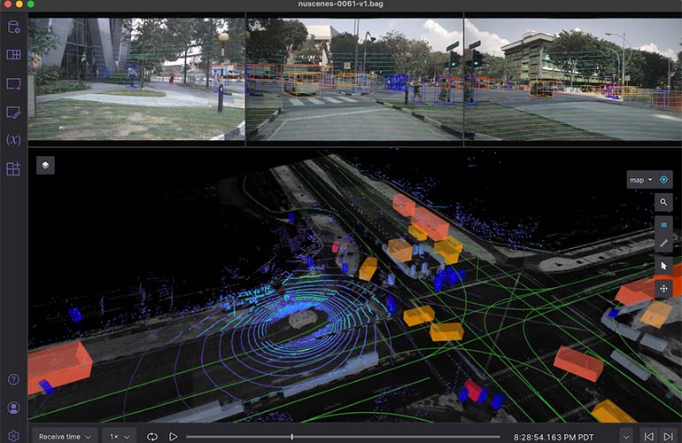
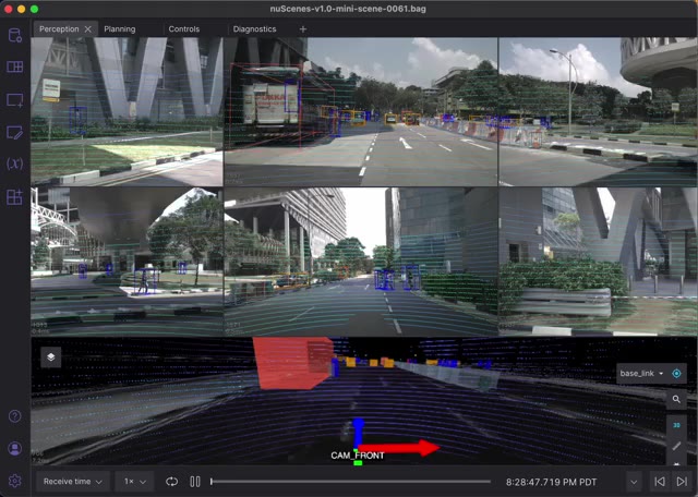
Different data visualization tools can help you make different judgments while solving different problems. Each step of a debugging or analysis workflow can benefit from a combination of diverse tools. In Foxglove Studio, for example, users can select from an extensive collection of visualization panels to build custom debugging layouts.
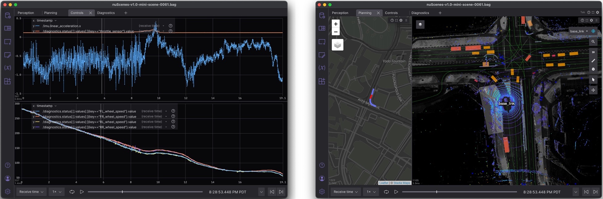
Each panel has a specific function – one may plot values, another mark coordinates on a map, still another display 3D models in an interactive scene. Whether you’re troubleshooting your robot’s planning stack or monitoring its diagnostics, there is a visualization tool for that task.
With rich interactive data visualizations, our means can finally catch up to our ambitions. We can now more deeply explore, analyze and make sense of our data – data that was impenetrable to us before – to accelerate ourselves towards our goal.
The future of robotics and data visualization
For as seemingly objective as it is, robotics development comes with no shortage of subjective decisions and creative solutions. Though the end result may be concrete as “the robot can now maneuver around the warehouse floor,” the means by which we get there is an endlessly iterative process that requires a great deal of human intervention. To successfully introduce robots to the public at scale, we need to acknowledge robotics as a more open-ended endeavor – one that produces more interconnected issues, has more situational solutions, and thus requires more diverse tooling than traditional software development.
Robotics development still has a wide array of problems that we need to solve – unwieldy testing infrastructures, unpredictable hardware development timelines, and scalable data management. The list goes on. But there are few improvements that will impact all verticals of robotics so powerfully as great data visualization tooling.
![]() About the Author
About the Author
 About the Author
Adrian Macneil is the co-founder and CEO of Foxglove, a startup providing powerful data management and visualization software for robotics. Prior to founding Foxglove, Macneil led Infrastructure and developer tools at autonomous driving company Cruise.
He has a passion for improving developer productivity, and believes that optimizing the developer feedback loop is critical to unlocking rapid innovation in robotics.
Credit: Source link
Comments are closed.